While he was swamped as usual, I was able to steal a few minutes of his time and talk about his latest Werner Labs project and asked if he had any tips to share for the blog readers.


I really appreciate all you do to push the science of elearning research forward. It helps the blog readers and anyone who wants to learn how to build elearning courses.
As you know, one of the main issues people have is a lack of resources and time. Your conference presentation on building PowerPoint presentations and elearning courses seems to fill that need. Can you explain more to the blog readers who couldn’t attend?

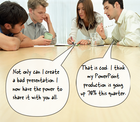
Each day there are thousands of PowerPoint presentations and many of them are not very good. On top of that, most elearning courses created with PowerPoint are not very good. That’s not going to change any time soon. But what we can change is the time it takes to build bad PowerPoints.
So we created a system where anyone who creates a bad PowerPoint can upload it and share it with anyone else who needs to create a bad PowerPoint. On top of that you can mix and match your bad PowerPoints to create custom-designed bad PowerPoint files.

We’ve already signed on many large corporations and government agencies.

I’m interested in seeing where that goes in the future. Let’s switch topics. You gave a presentation on visual design for elearning. Afterwards, people were buzzing about what they learned. Can you share your tips for the blog readers, too?

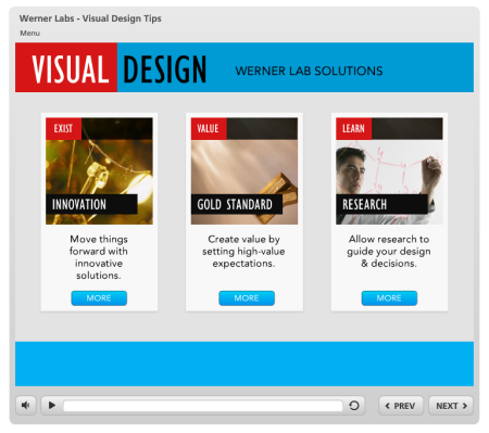
Sure. The presentation covered three key areas of graphic design for elearning.
- How to build better elearning in your organization
- Get past low-value bullet point elearning courses
- Apply NEW research to your elearning courses
Presentation on How to Build E-Learning Courses

Thank you Dr. Werner. You always offer fresh insight and new perspectives on how to build elearning courses. I am sure that the blog readers really appreciate all you do for the industry.
From Dr. Werner Oppelbaume in http://www.articulate.com
3 Visual Design Tips for Effective E-Learning
